| My Role |
Team |
Affiliation |
Timeline |
| UX Researcher |
Myself
1 UX Writer
1 Project Manager |
Hack for LA |
Oct 2022 - Dec 2022 |
Problem
1. The carousel copy needs to be updated due to a change in design principles:
Access the Data is pivoting away from containing an educational component. Instead, Access the Data will serve as a data access point for open government data.
2. The carousel copy is not consistent with the Access the Data brand voice:
Need to improve clarity and consistency in the AtD brand voice.
Impact
Proposed the initiation of a review for the team to reassess the website's design objectives.
Identified the brand voice that connects more resonantly with potential users.
Research Questions
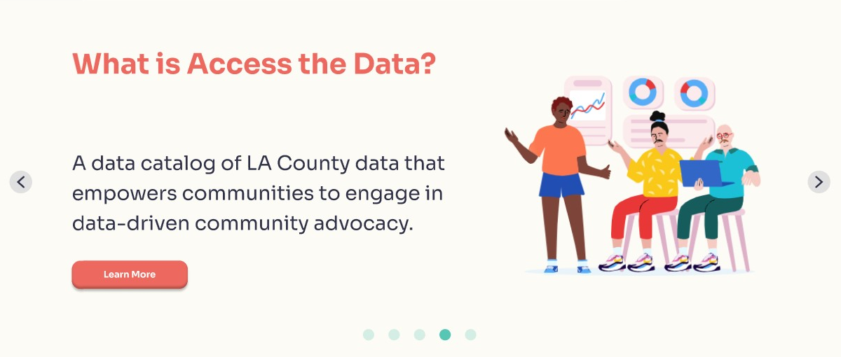
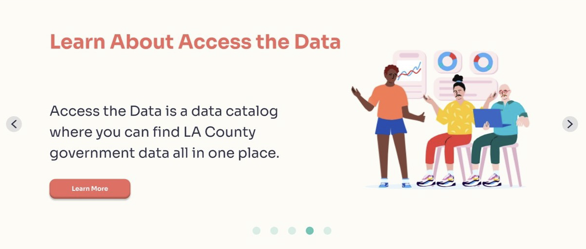
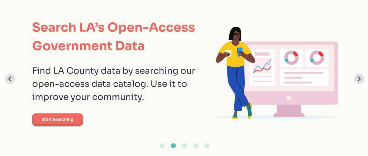
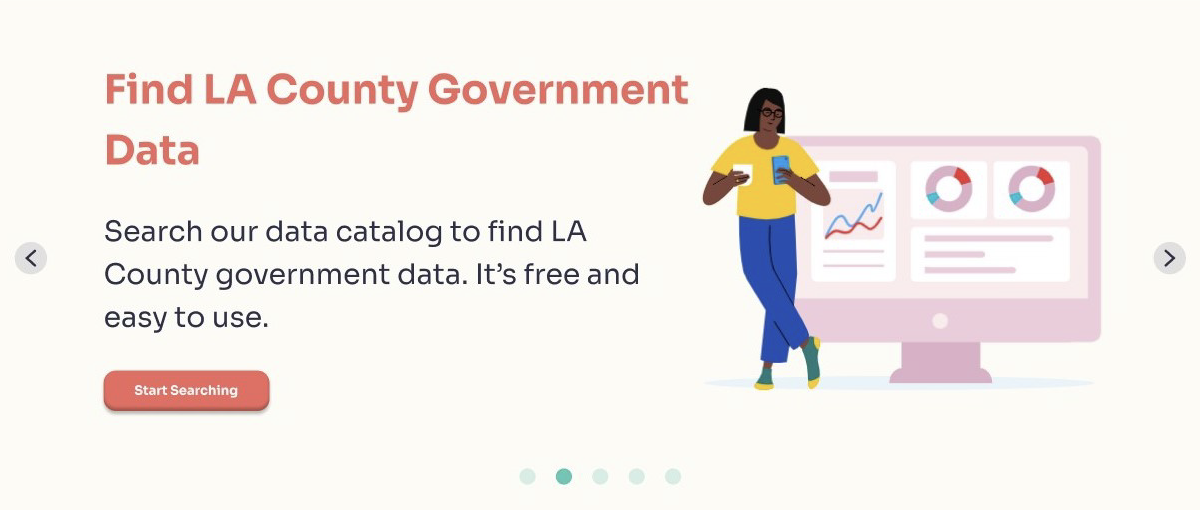
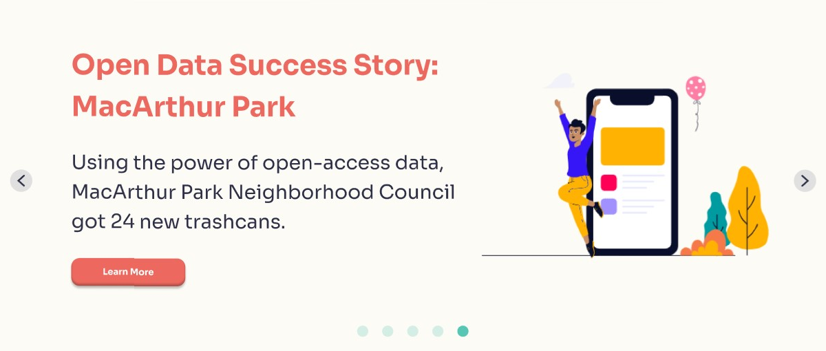
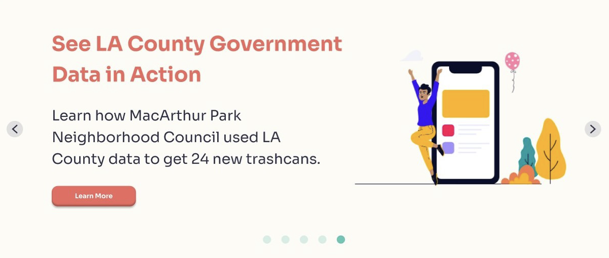
After talking to the UX Writer on the team, we decided to test two different brand voices (empowerment vs. simple) developed through previous research.
Which one do users find easier to understand?
Which one do users find more interesting?
Which one has higher conversion rate?
Goals
Determine which brand voice resonates better with potential users.
Research Design
Recruited 82 participants from various subreddits and UX-related Slack servers.
Conducted an A/B testing using Qualtrics on four carousel items.
Participants were randomly assigned to either the empowerment or the simple condition.
Asked additional survey questions after the A/B testing.
Research Materials:
Item #1 (Empowerment vs. Simple)
Item #2 (Empowerment vs. Simple)
Item #3 (Empowerment vs. Simple)
Item #4 (Empowerment vs. Simple)
Analysis
Computed independent samples t-tests using R.
After cleaning the data, 55 responses were included in the anaysis.
Findings
In general:
There was no difference between the two themes in the scores for (1)how interesting the copy is and (2) the conversion rate.
The simple theme is better when considering how easy the copy is for users to understand.
Individual items:
For #1, the simple theme is better for understandability and conversion rate.
For #2, the simple theme is better for understandability.
Either theme works for #3 and #4.
Recommendations
If our goal is to make the copy easy to understand, choose the simple theme.
Revisit our design goals and decide.
Additional Findings
Experience with open-access data:
63% of the respondents have used open-access data before.
63.7% of the respondents said they use open-access data often or more.
Community activism:
53.7% of the respondents said they're interested in community activism.
On a scale of 1 to 5, respondents' average score in terms of how interested they are in community efforts was M = 3.52, SD = .84.
How to make open-access data more accessible:
Themes from open-ended responses:
Settle a clear definition of what "open-access data" is.
Provide concrete examples of data use cases.
Increase the findability of data.
Room for Improvement
Define target audience through qualitative research before conducting an A/B testing.

